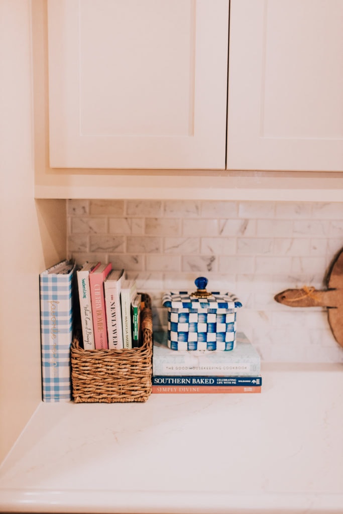
Art | Barstool Option | Breakfast Nook Lighting | Kitchen Pendants | Maddie Hughes Designs | Kitchen Runner | Similar Kitchen Chairs | Breakfast Table | Similar Table | Maxi’s Chair | Dress {size 2, get it on sale with code KATEY10} {c/o} | Booties | Belt, Similar | Butter Dish | Recipe Box | Compote | Tea Kettle |
When we first started decorating this house, y’all asked for mid-way posts and I’m so glad y’all did! My normal nature is not to document the “middle process” but I feel like the first few years of living in a home is ALWAYS a middle process. Furniture takes months to come in, you wonder about paint swatches for weeks {my current situation with Maxi’s bathroom!}, and let’s not forget we have jobs and LIFE going on that take precedent. 😉 Documenting the “middle” has not only been a wonderful act in gratefulness but has made each decision more exciting. To stop and photograph each spot, even when the hardware isn’t installed and things don’t feel complete, has made me appreciate each stage.
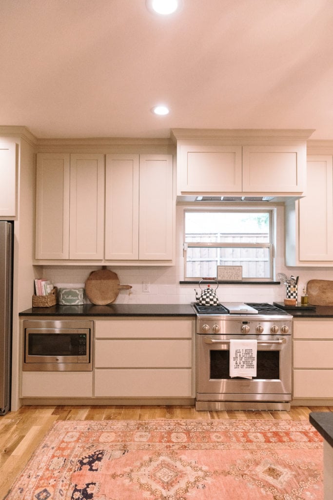
The most recent home project we did was the glass countertops and backsplash, so I wanted to share a post with that. When we first moved in, we switched out the kitchen light fixtures. I’ll share a major before and after once it is finished. We sat on countertops for a few months. I originally wanted to replace them, then ended up really liking the black. It went well with the floors. However, it was a matte “leathered” black {I don’t know what it’s called but it had texture!} and it was not my favorite for cleaning. It showed any dust or ounce of breath on it. Paul kept commenting he wanted to replace them for that fact alone, so we decided to really do it! This feels more us and more like my style. Not to say I didn’t like the black, both have been great in our home. But one is FAR easier to keep clean {current 😉 } and feels like it blends more with our living space, since it is open concept and a bit tight on space. In addition to the aesthetic appeal of your kitchen, you should also consider its functionality. For instance, you may seek garbage disposal services to install a garbage disposal in your kitchen. For top-notch plumbing solutions in your kitchen remodel, trust Sunny Air Conditioning, Plumbing & Electrical for Indio plumbing services in your home or business.
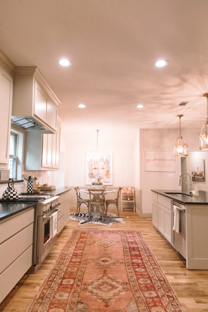
Here is before counters, so you can see with the floor and rugs the black truly looked fine! I think had it not been that textured granite from local granite wholesalers I wouldn’t have been that inclined to change it. But another note to make is our living space is smaller in this house. The dining is large and our kitchen is huge. We could host a party just on the kitchen runner. ha!
However, the space from barstools to sofa and tv is much more narrow, so I’ve found having lighter countertops really draws the eye in a constant line forward, so it looks less broken up and more spacious. But we’re still doing research on integrated vs built in wine coolers.
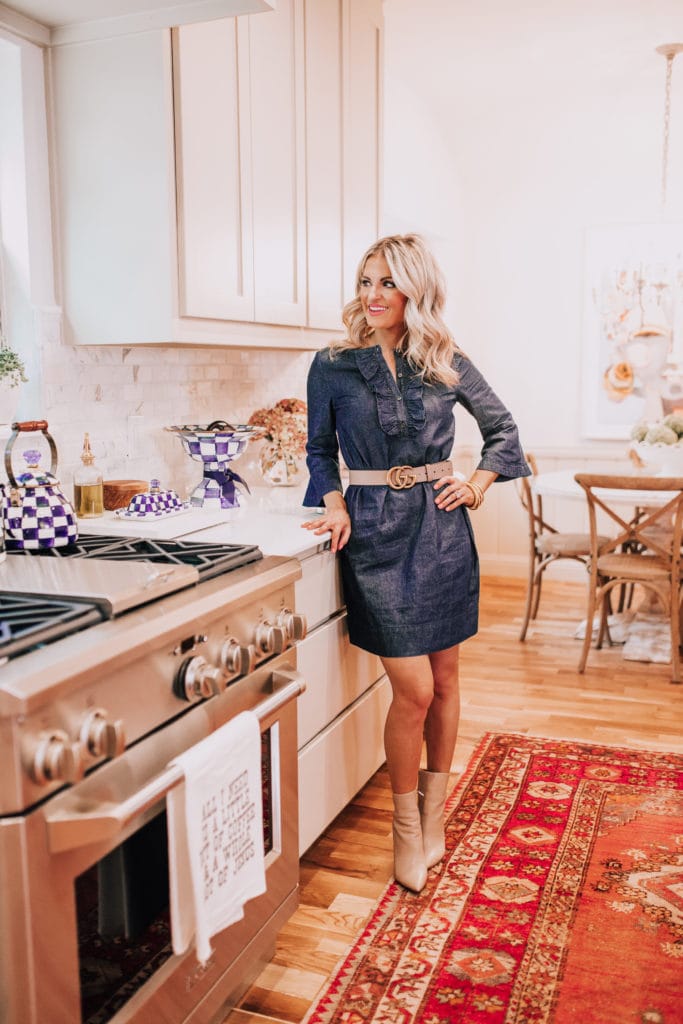
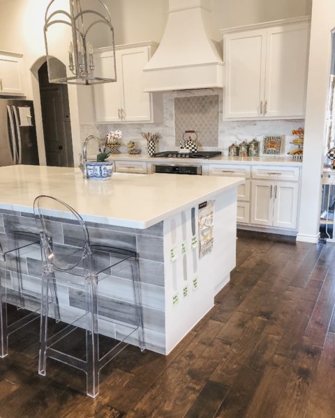
The counters we chose were Silestone Calacatta Gold with an ogee edge and we did a marble subway tile backsplash with white grout. Our counters are granite and so easy to clean. I love marble, truly. Who doesn’t?! But after having a true marble coffee table in our house before Maxi I swore up and down, I was not the right person to own it. Some people can seal and be so careful and never run into an issue. I’m NOT that person. We had our coffee table sealed at least 2 times and I stained the thing every week. I leave red wine spills on counters, cut up cantaloupe, sometimes nail polish remover. Yikes. It’s like my one laid-back piece of my personality comes out in countertops, and I knew if we did marble I’d sadly ruin it. Maybe in my dreams, I can be an adult who knows how to have marble. 😉 With our floors having a warm tone and our cabinets being warm as well, I was glad we did something more white with a gray and gold vein. The Calacatta Gold has light veins and spots of gold, so it blends with warm floors really nicely! When considering such design elements, consulting with experts in oahu plumbing ensures that any necessary plumbing adjustments or installations complement the overall aesthetic seamlessly.
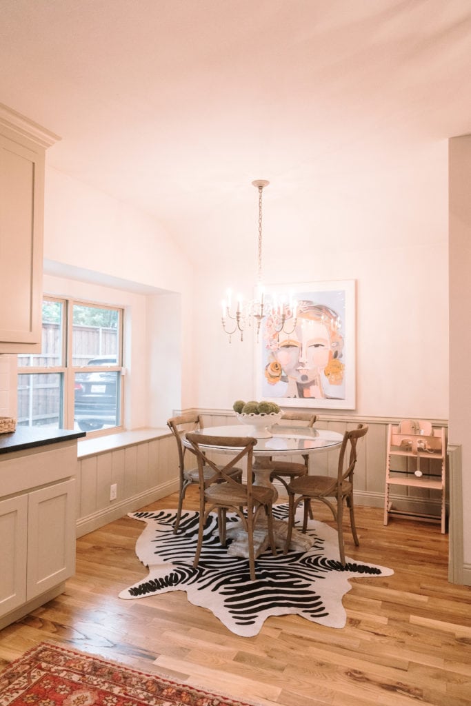
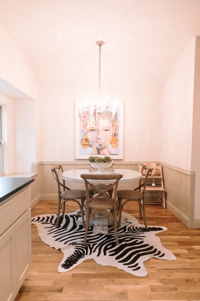
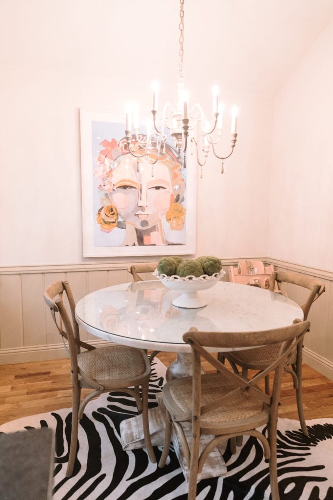
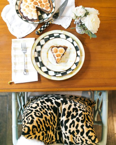
We did end up pulling this zebra rug out from under the table. We had too many spills with a toddler, so I sold it on a Facebook group. But the exciting part is we added beautiful prints in the window sill area. We currently have two pillows there and then are having a bench cushion made with a nice, neutral Schumacher print. The pillows have blues and greens in them and the window coverings there will match the pillows. This is the print above our kitchen table and we got it in the largest size available!
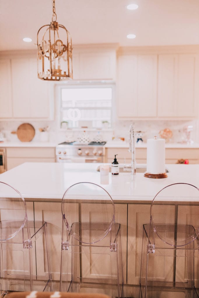
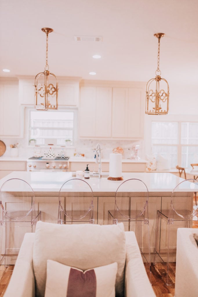
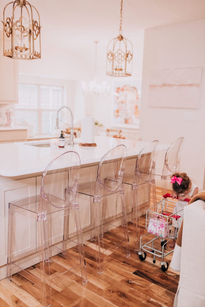
Let’s talk barstools! This is actually a really common question I get. You may remember I first owned the Ballard Designs Dayna Stools in our last home. NOTHING was wrong with them and I loved them, but we did sell them because we were originally going to paint the island the same color as the barstools and so it was a bit too much green. Then, we moved, the painting never happened, and you see where I’m left. After I sold the last barstools, I went with a more affordable lucite option since they were easy to keep clean. I’ve had these for 2 years and people ask if they are comfortable. Ehh, about as comfortable as any other lucite chair. We don’t sit on them a TON as we gravitate towards the kitchen table. I’ll sit on them when I’m answering e-mails or having a glass of wine with Paul. My sister sits on them the most often when she comes over for dinner since she’s in college and rarely cooks for herself. 😉 The pros are they are SO easy to clean which is nice with a toddler. I don’t worry about fabric stains. They also help alleviate the tight space between the kitchen island and the living area. Since a lucite barstool doesn’t stop your eye, you can continue to see into the living space and it feels more spacious. My dream barstools would be these but I really do worry that it would look too cluttered. If I had ZERO budget and had won the lottery, I’d love these. But then again, not having a back worries me with Maxi and I just could not spend that on barstools. So, that’s my barstool rant. 😉 Nothing was wrong with my Ballard Designs ones, minus the fact I thought the colors were going to clash. I like the lucite ones- they aren’t as comfy as Ballard, but they work!
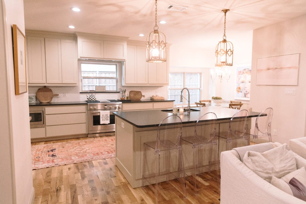
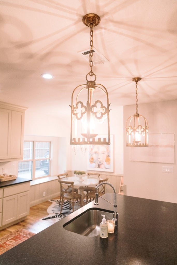
Now for lighting, this is a change we made pretty early on. These are our kitchen pendants and I’m so in love with them! You get that traditional lantern look with a bit of French flair and I always smile when I see them when I come home. These are similar as well, if you wanted another option. For the breakfast nook, I actually got the light fixture from Restoration Hardware Baby. One of my biggest tricks is to get light fixtures from “baby” sections because you will save SO much money! We got our light fixture for $389 since we have the RH Membership and I could not be more pleased.
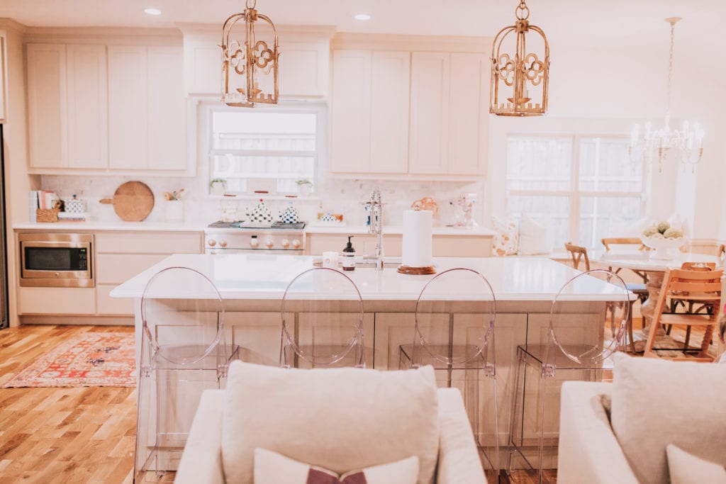
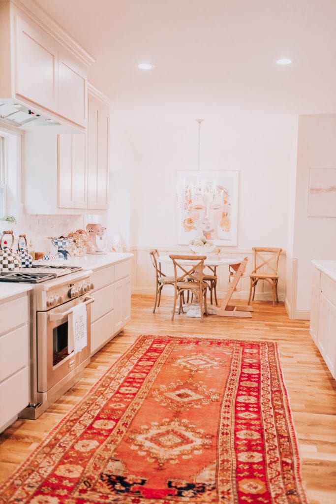
Our runner is from Tall City Textile. If you follow my Instagram, you probably see videos of Maxi dancing on it each night. It’s her favorite thing we do in the evening.
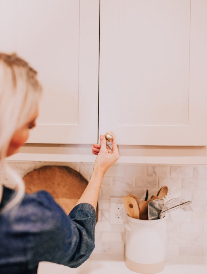
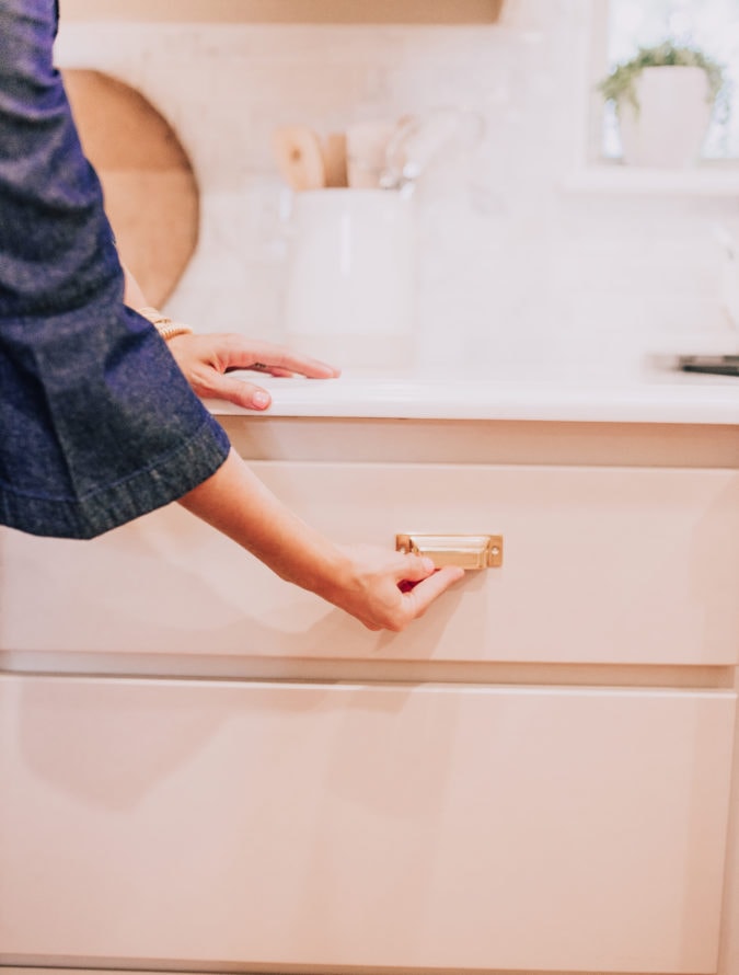
Our hardware recently came in and we are just waiting on it to get installed! Maddie selected our hardware. It’s a traditional brass and each drawer will have two of the bracket pulls on them. I think when that is installed it’s going to look completely different and I’m just excited to have hardware so I stop slamming my finger on accident. ha!
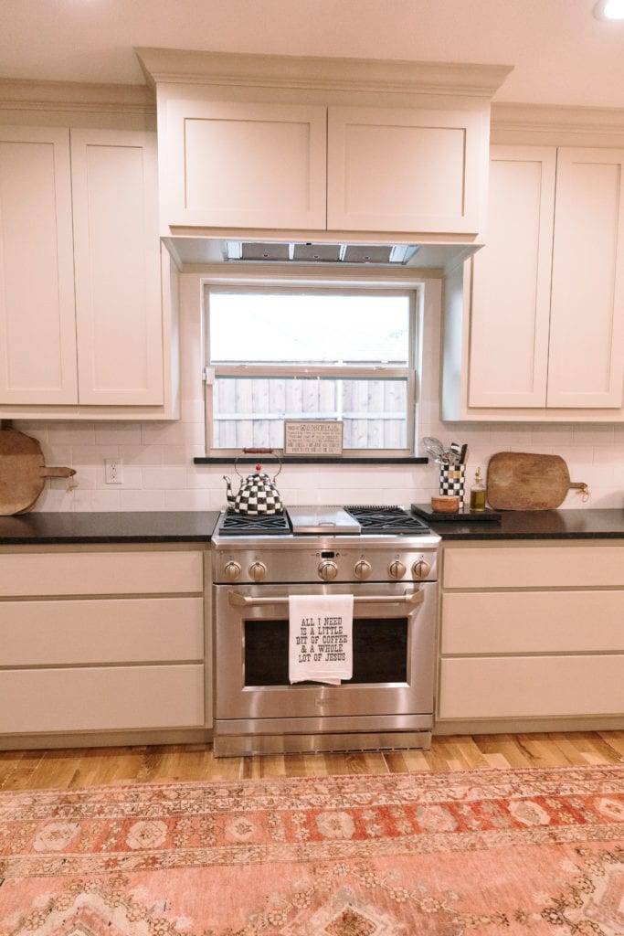
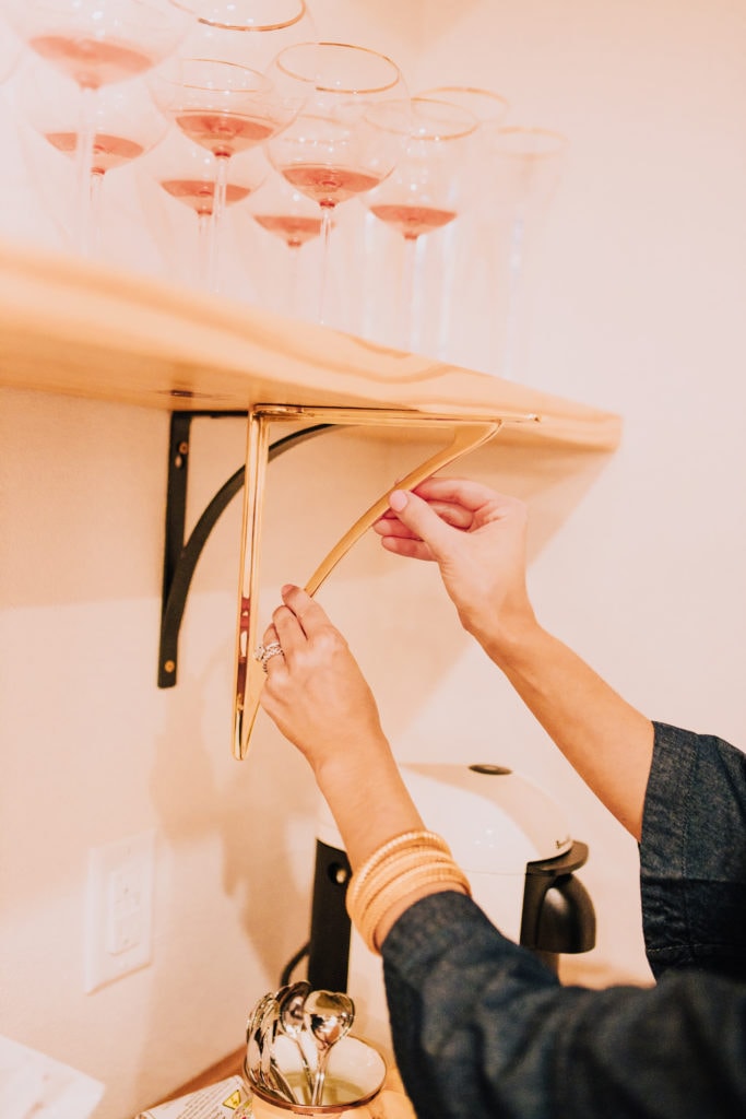
One side of our kitchen has a butcher block which we ended up keeping. I went back and forth {for weeks!} on replacing it with the counters or keeping it. Ultimately, I loved the warmth it provided and I love to use it! I do all my baking on it, so it just made sense to keep it. Once our counters were installed, I was thrilled with my decision because it gives a bit of an “unfussy touch” {that’s probably not the right word, but the only word that comes to mind} and feels very homey. Plus, I use the butcher block daily. Now for the shelves above, we are changing those. We will use those brass brackets for hardware and are actually looking at glass shelves. It will add a touch of glam to the block, which excites me. We are also removing the top shelf. Maddie and I decided it’s just so tall it isn’t functional and doesn’t make sense to have. I’ll use the glass shelf to store glassware.
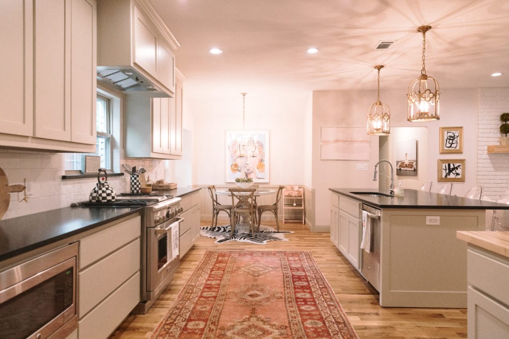
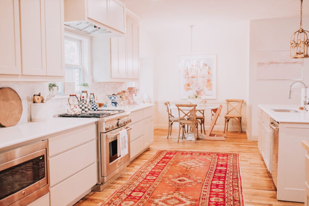
This is the space in our home that gets used the most and makes me the happiest. Last night, I made scones for the first time {try this recipe, so good!} and as I was sitting eating them, I just kept commenting to Paul how much I love our kitchen. It’s filled with things that make me happy, like all my MacKenzie-Childs teapots! It’s livable and functional, unfussy, yet styled to my personal taste. I spend about 70% of my day in here either cooking, answering e-mails, cleaning, or dancing with Maxi. It’s where I first enjoy my morning coffee and wind down for the evening before bed. I hope you all enjoyed this “mid-update” post and my thoughts on our kitchen. What’s your favorite part of your kitchen?


Such a great update! I really love the pieces you chose for your kitchen. Lovely! ❤️✨
Charmaine Ng | Architecture & Lifestyle Blog
http://charmainenyw.com
Gorgeous!! Really love seeing the transformation of the space. I love the “mid updates” because you can see see the impact of each chance along the way! Love your home style and looking forward to seeing more updates. Thanks for sharing!
Love the look of your kitchen! It’s really beautiful and coming together nicely! Just curious, should the pulls be a little longer or larger on such a huge cabinet drawer? I feel like the current size in the picture looks like it will be swallowed whole by the massive cabinet drawer there? Just wondering your thoughts?
Hi Jillian! Totally see what you are saying. It definitely looks that way with one of the pulls there, so totally see your thoughts! With the two pulls we are putting on each, it ends up looking really balanced, but with one not at all! Maddie drew it out on her computer so we could see and wouldn’t be nervous and it looked really even with spacing. xx, Katey
What a beautiful kitchen!! I love your taste so much. I LOVE that it’s not all cold and gray. The touches of warmth are so nice and perfectly balanced. I think that backsplash has to be my absolute favorite. It is perfection ?
P.s I just bought the espadrille wedges in your last post. They are 60% off right now! ?
Aw thank you, Jessica! It feels so cozy to me and makes me so happy! Ahh, that’s amazing! So glad you got them for a deal! xo, Katey
I love the white bowl on your table! Where is it from?
Aw thank you! It’s a Homegoods find from about a year ago. Xx, Katey
Sorry I’m a little late to the post! I LOVE the red runner you have but the link for Tall City Textile isn’t working. Is the store local to DFW? Thanks!
Hi Chrissie! I think they switched their Instagram Handle and that might be why! Check out @milagrocollective on IG and I think that is their new one. 🙂 xx, Katey
Hi can you let me know the brand of your kitchen hardware
Rejuventation Hardware! 🙂
Your kitchen is beautiful! I love the gold pendants. They are perfect! Do you happen to have a new link for them? I can’t get the current link to work.
Hi Diana! Thank you so much! I’m so sorry, those are older from One King’s Lane and sold out. They were the “Baltic Lantern.” I hope that helps!