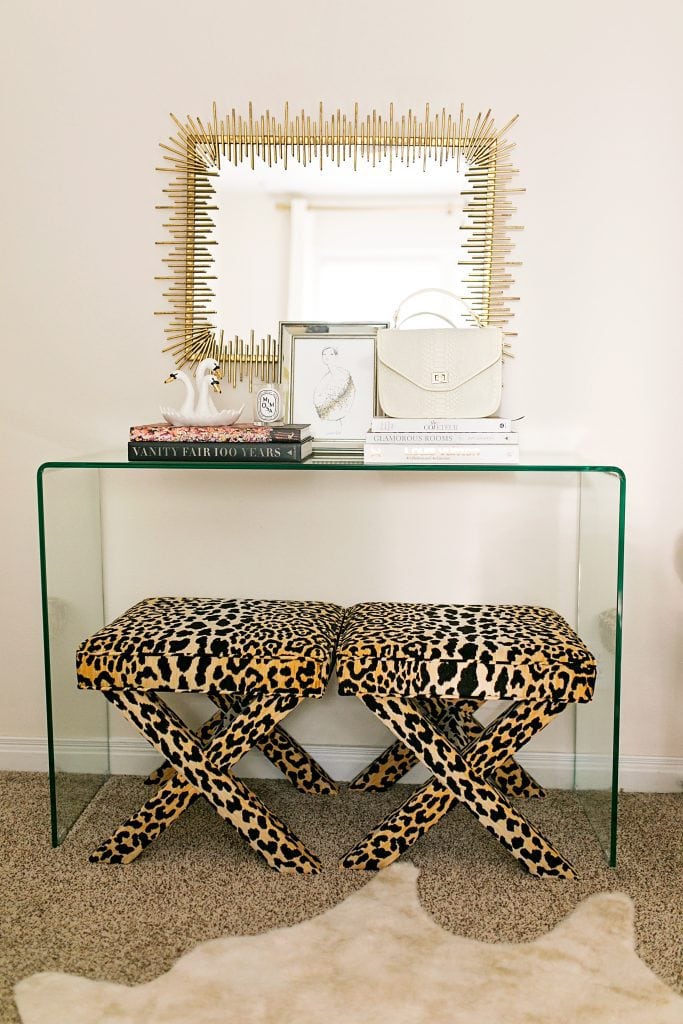
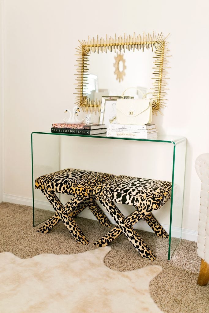
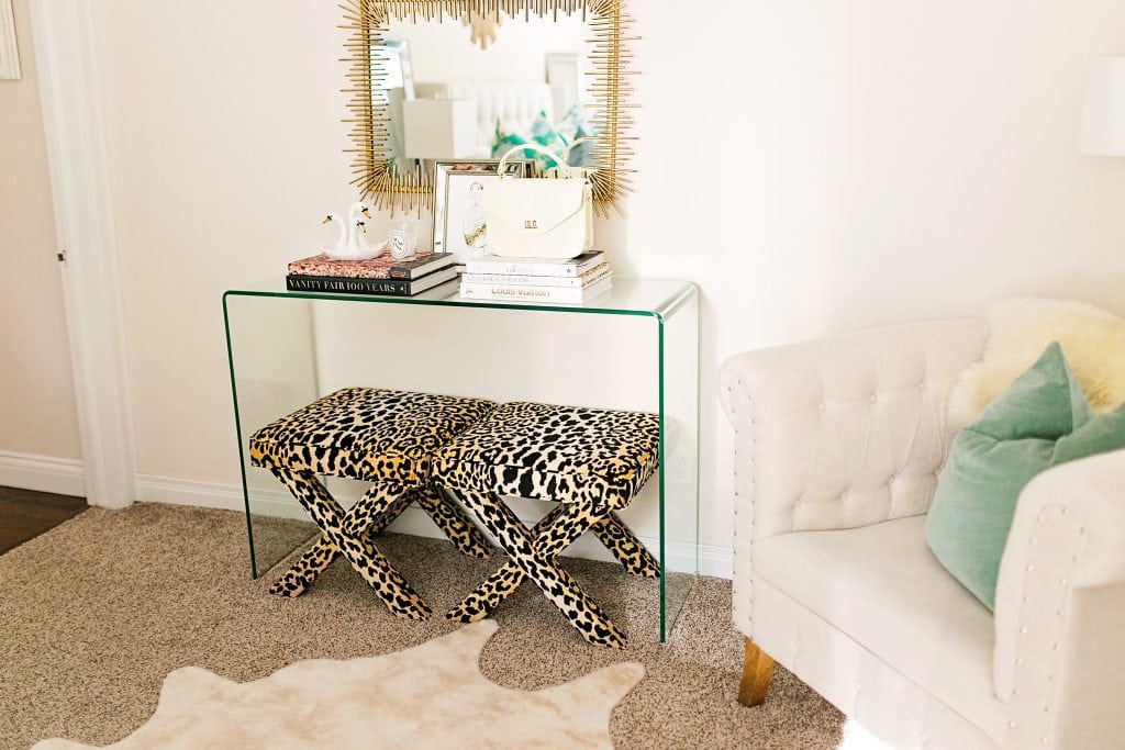

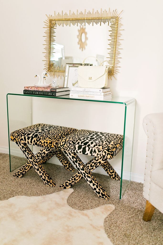
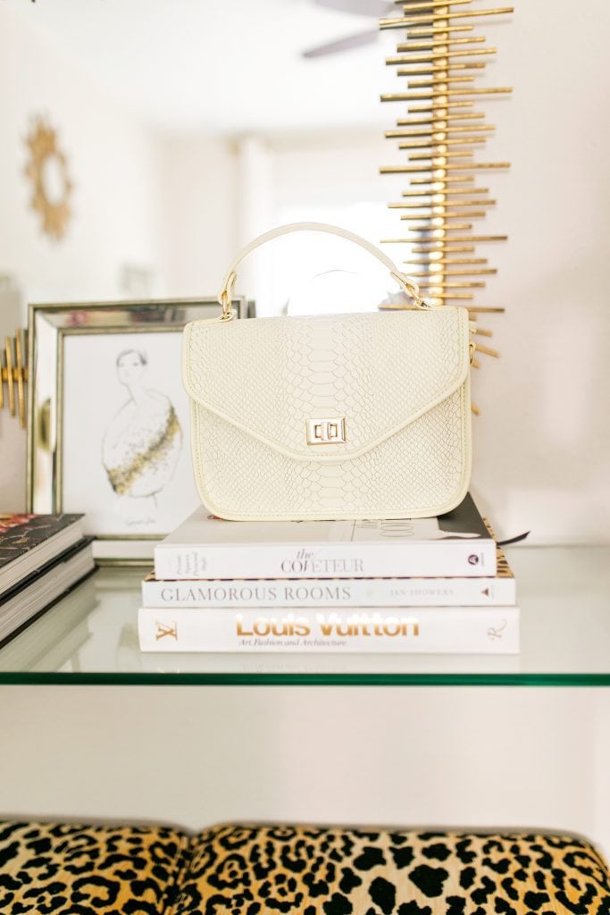
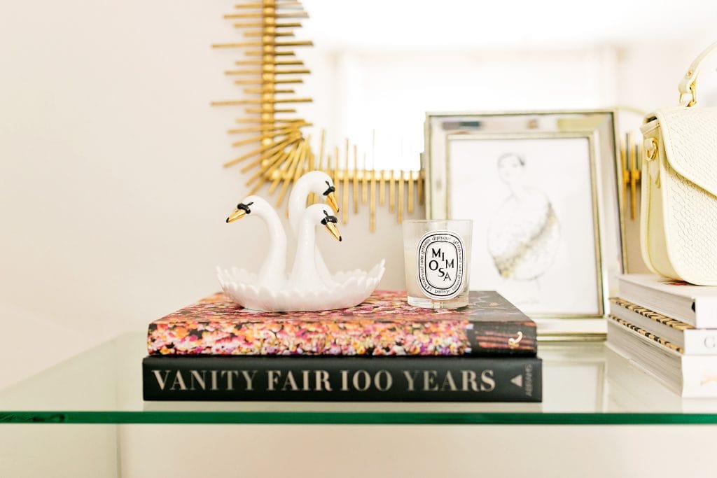
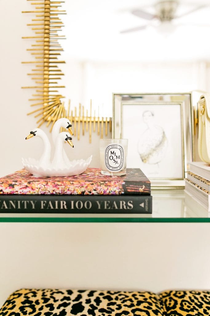
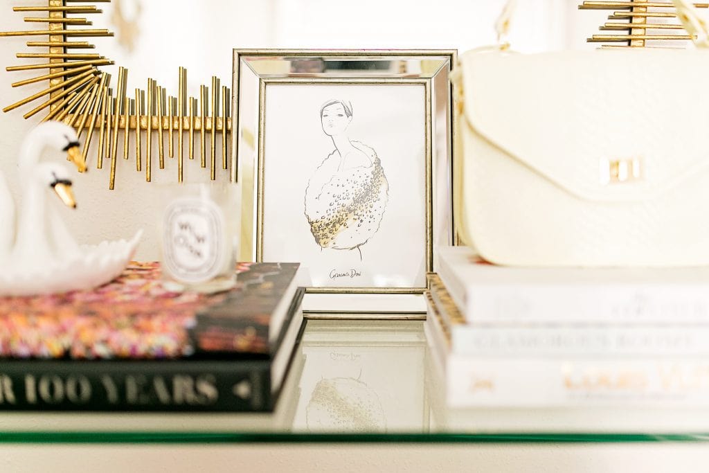
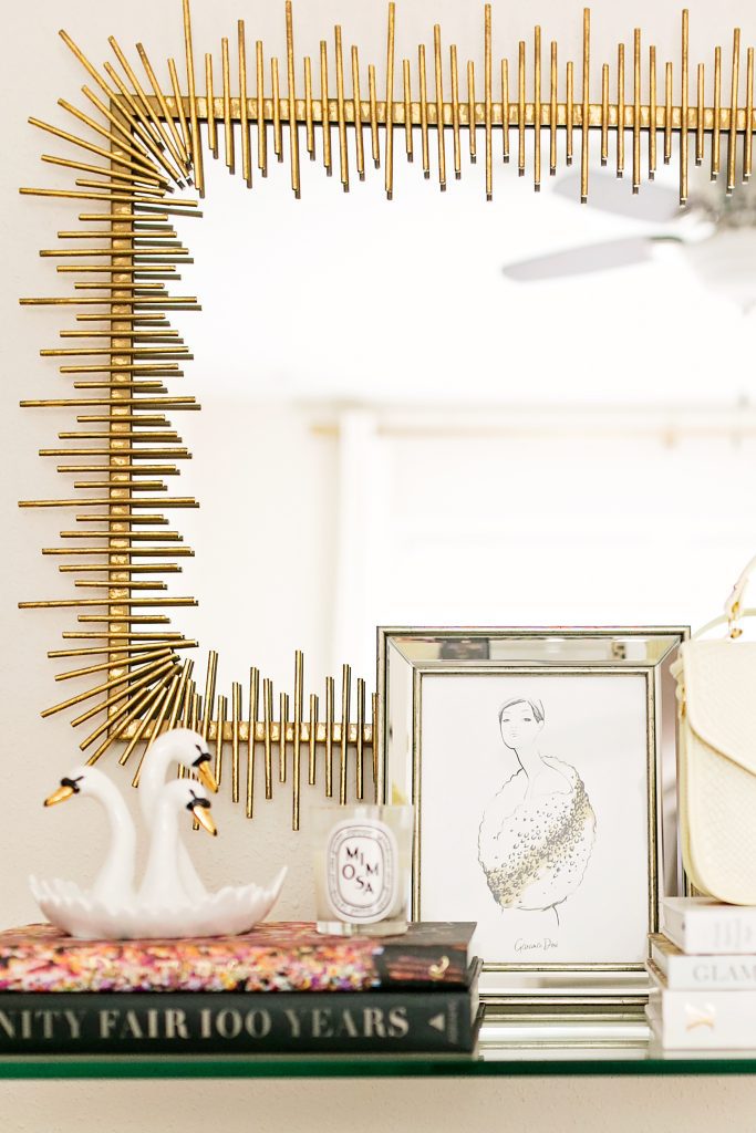
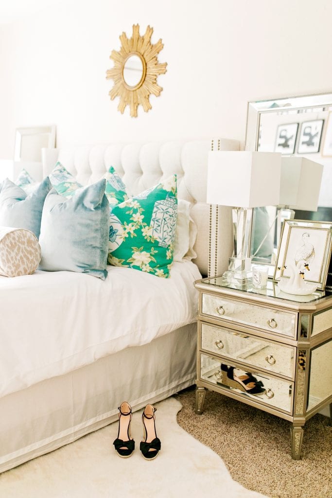

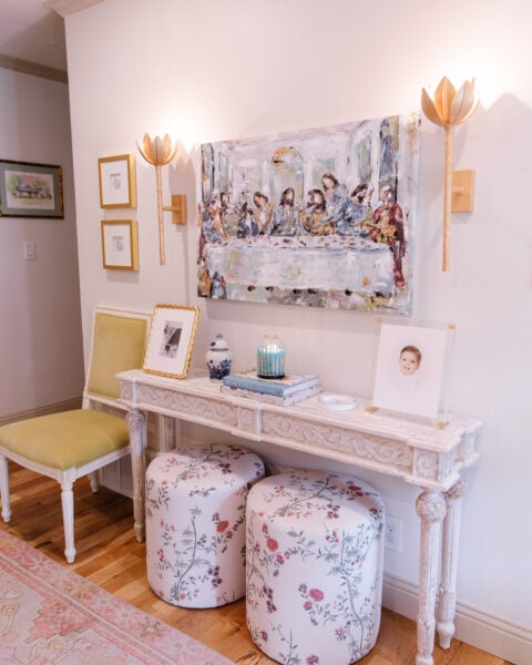
Console: Lulu & Georgia [c/o] | Rug: Lulu & Georgia [5×6] [c/o] | Swan Dish: Lulu & Georgia [c/o] | Print: Lulu & Georgia [c/o]
Photography by: Angie Garcia
Awkward spaces. Let’s talk about them. They pop up in our homes/apartments/townhomes and you think, “What do I put there?” You might ask your mom, a girlfriend or even your spouse and chances are you don’t like any of their ideas, either. It’s because it is an awkward space and it can be hard to envision what to place in the area.
We had an awkward space in our master bedroom and I hadn’t styled it the entire time we lived there! Our master bedroom is the room in our home that while looking at it I thought, “Uhhh….what was the builder thinking?!” When we first purchased the home our master had 4 doors. FOUR! A door to the outside [traditional in older homes], a closet, a door to my office and a door to the hallway. With doors on each wall I couldn’t figure out which way to place our furniture. When we purchased the house we were engaged and we didn’t live together until we were married, so I had to move in first. I told Paul he was insane if he thought I was sleeping in a bedroom by myself with a door to the outside. So we closed on a Monday and I got that door enclosed on a Tuesday. 😉 But then we were still stuck with 3 doors. When you style a bedroom, designers typically say the first thing you should see when you walk in is the bed. That didn’t work in this room with the layout so after we arranged our furniture we were stuck with this awkward wall. After a few years of not knowing what to place there, I thought of what we needed there: a catchall. We desperately needed a spot where I could toss my jewelry, Paul could place his wallet and I could put my bag. We don’t have an entryway per say, so this would have to do! And I have to say I love how it turned out!
First things first, I knew I needed a console table because this is right where you walk in our room and I didn’t want to be running into a dresser or something wider. I also wanted it to be pretty seamless and not distract from our other furniture. I went with this clear glass console from Lulu & Georgia. My favorite thing about this piece is that in another home one day it will be a perfect entryway item! You may see glass and clean lines and think, “Oh, that’s so modern!” But this really can pair well with any decor from Transitional to Hollywood Regency. It just takes on whatever style you accessorize it with! Then, I wanted to add a little spot to put my jewelry and I didn’t want a jewelry dish. I’ve done a million jewelry dishes and it just feels cluttered like a bowl of bracelets sometimes. I had seen this swan on a blog before and wasn’t sure where it was from. When I saw it on the L&G site I was thrilled and knew I had to get it! You know how you have like 5 things in your home that if you had to start all over with decor you’d still keep? Or am I the only person with that kind of list…? This little swan dish is one of the 5 and I love how it looks vintage! I accessorized the rest of the table with items we already had like books and candles. I knew I could place my handbag on the other stack of books when it isn’t in use and Paul places his wallet and watch in the middle of the books when he gets home from work. To identify that separation I added this print as well!
Lastly, our bedroom didn’t have a rug. I’m always changing my throw pillows on our bed [another reason I always keep white bedding!] and so I could never commit to a rug. The prints made me nervous because what if it clashed one day? Paul actually found this rug and liked how neutral it was [#husbandproblems] and I had to agree! It feels soft and inviting, which is exactly how I wanted our bedroom to feel.
I hope you like this little spot I filled as much as I do! Thank you for reading!

You really do have an eye for styling interiors. Thank you for the tips, awkward spaces are the worst!
Charmaine Ng | Architecture & Lifestyle Blog
http://charmainenyw.com
Love this post! You do such a great job of explaining why you did certain things in your home decor posts. Your house is adorable. And if you ever quit the blog (which you shouldn’t!) you can use it as your portfolio when you become an interior designer 😉 Definitely bookmarking this one for future inspo.
Where do you buy your coffee table books? You’ve got some great ones.
Love this post!!! I’m moving apartments in just a few months and totally saving this post for later 🙂 That mirror above the console table is absolutely stunning.
Always,
Allie
https://champagnetuesdays.blogspot.com
I just loooooove your style!! And YES…..You will use that console table wherever you may roam !!! XOXO
Great idea! Love your little spot! It looks perfect!
Your style is incredible. I love your home.
Greetings Katie