In collaboration with Corbett Lighting. All opinions are my own! Photography by Madison Katlin
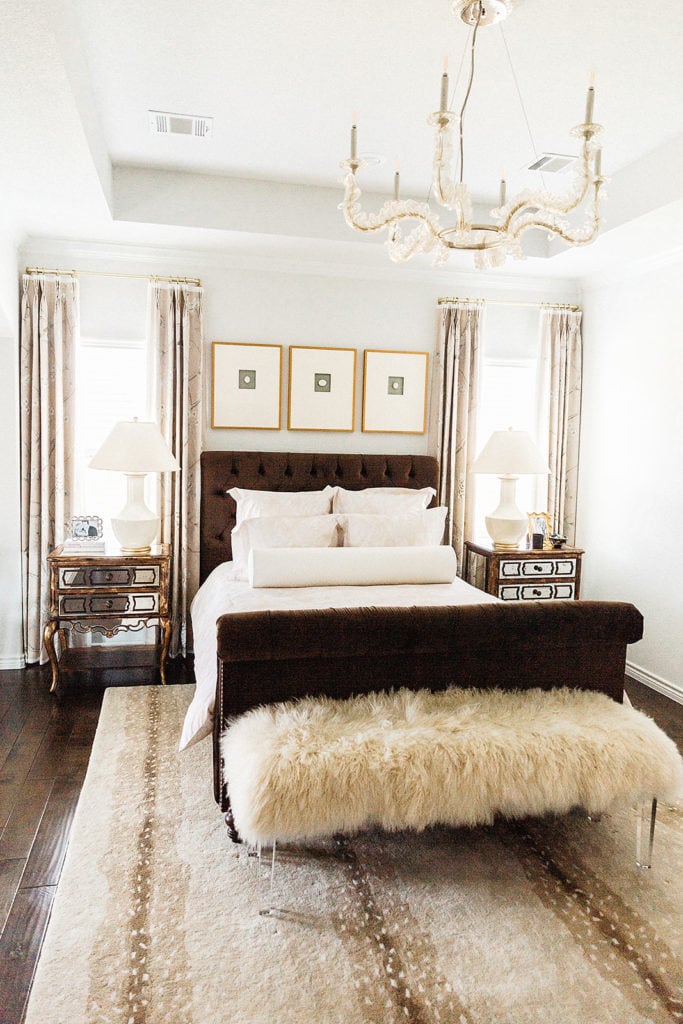
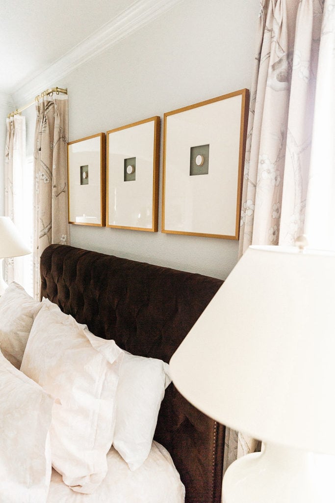
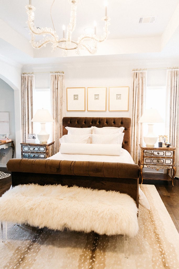
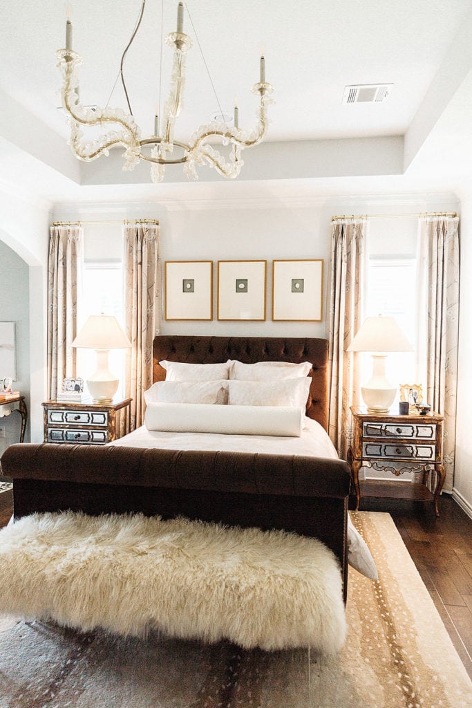
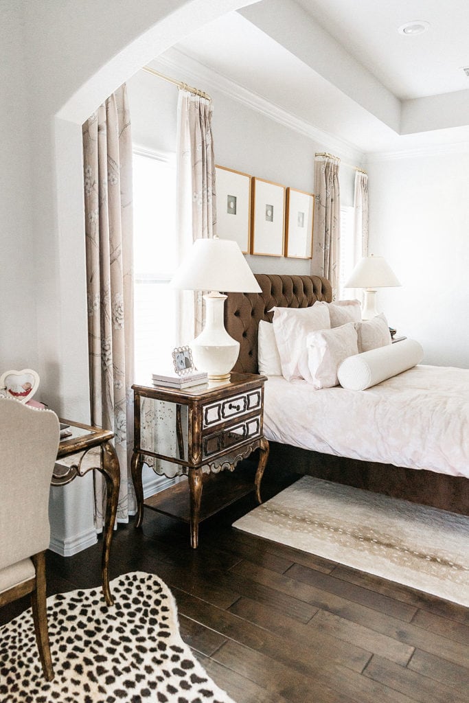
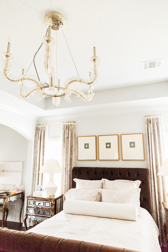
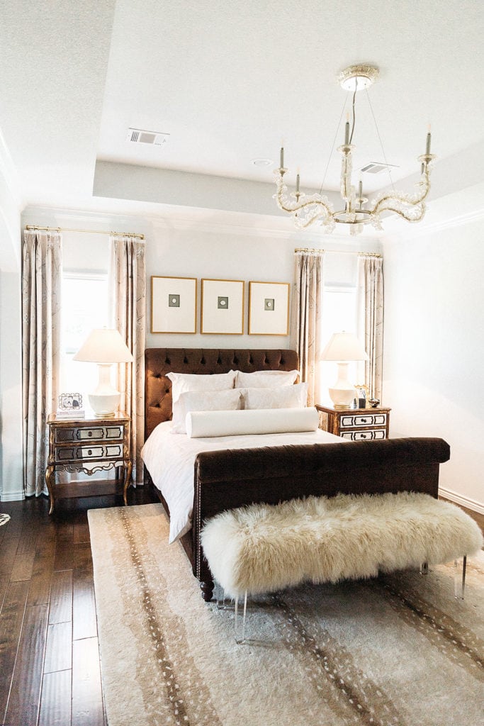
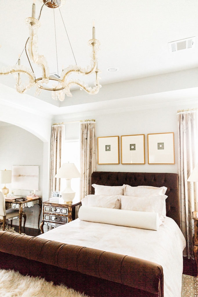
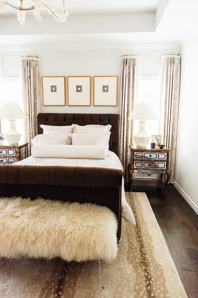
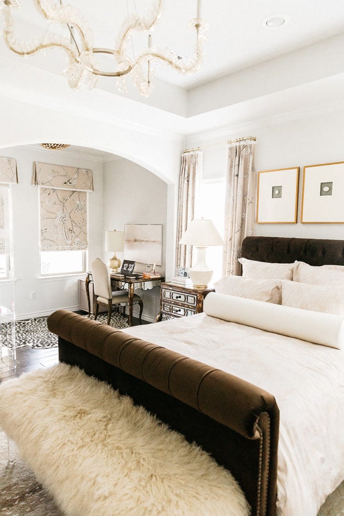
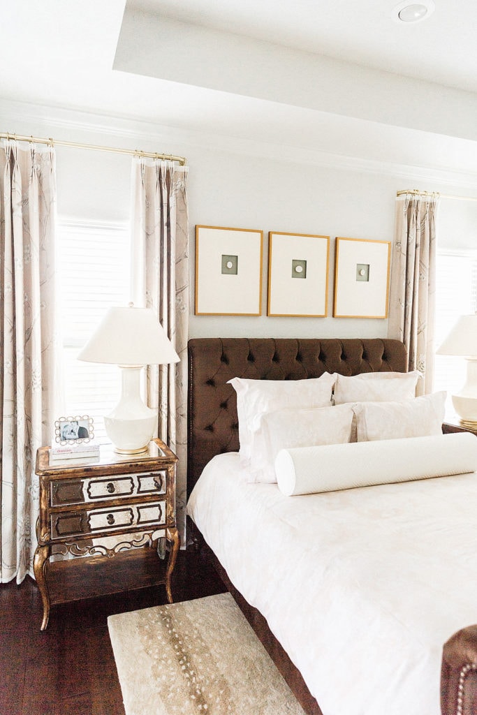
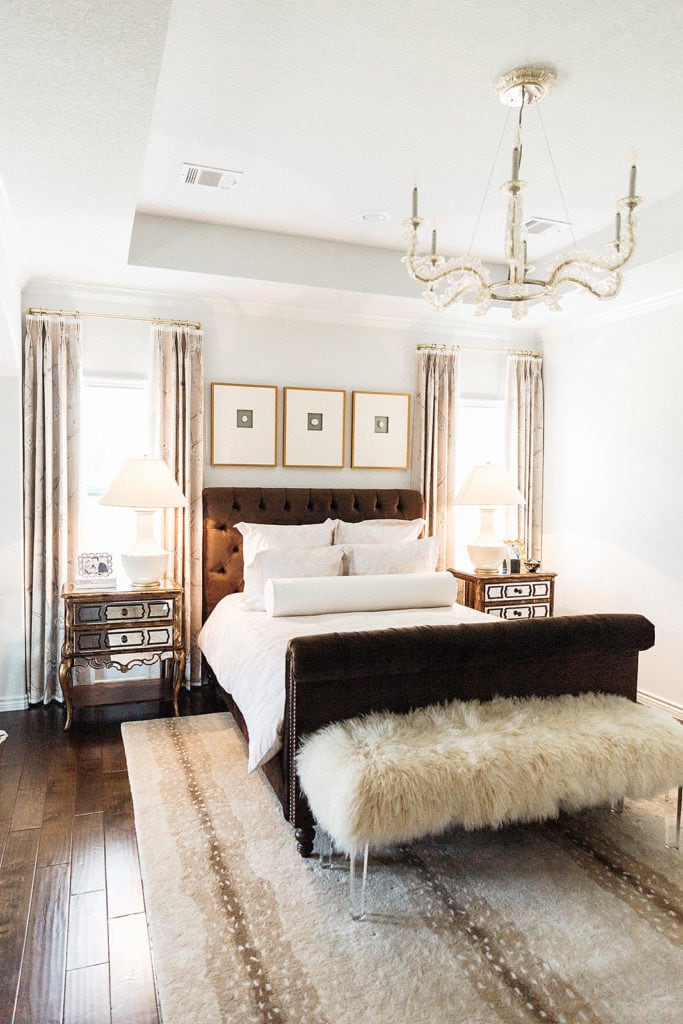
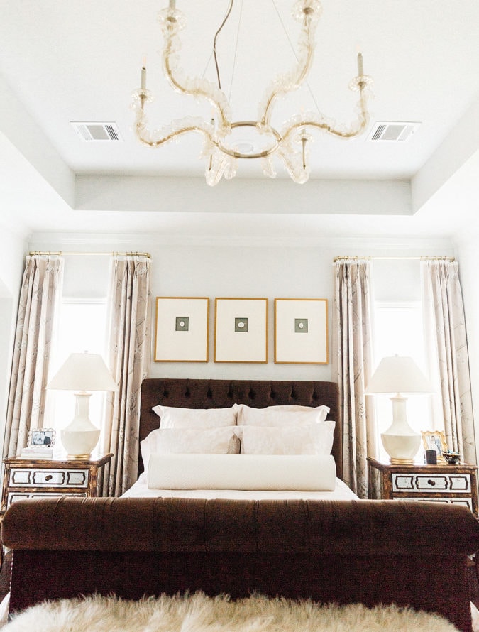
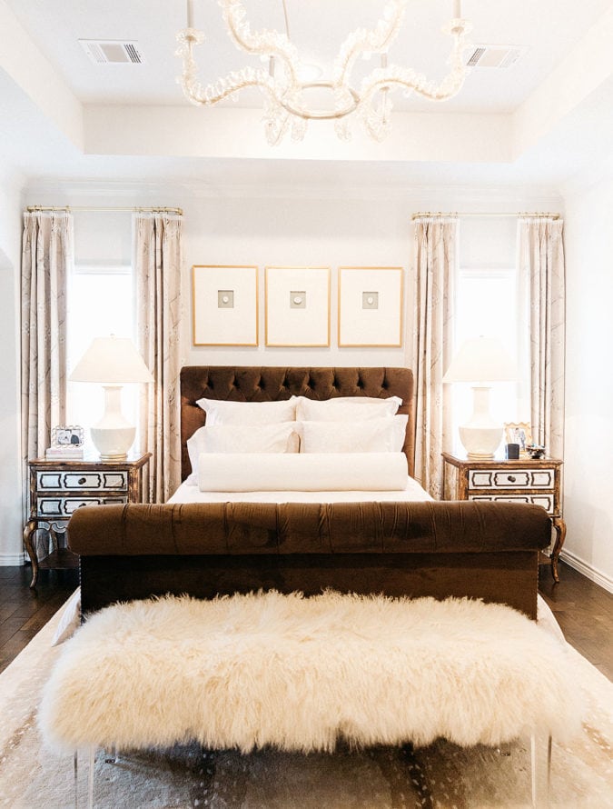
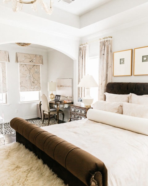
I think this room is proof that lighting and textiles can transform a room without having to buy furniture, no?! Today, I’m excited to kick off a two-part post series on our master bedroom. Today we are talking about one major change {lighting} and the concept behind the room with our designer, Maddie Hughes.
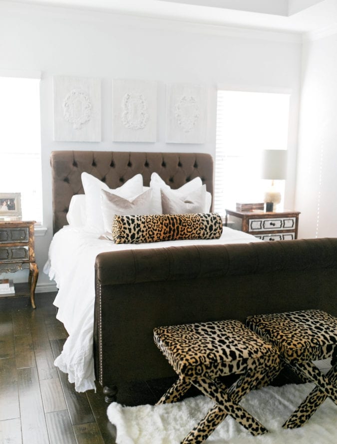
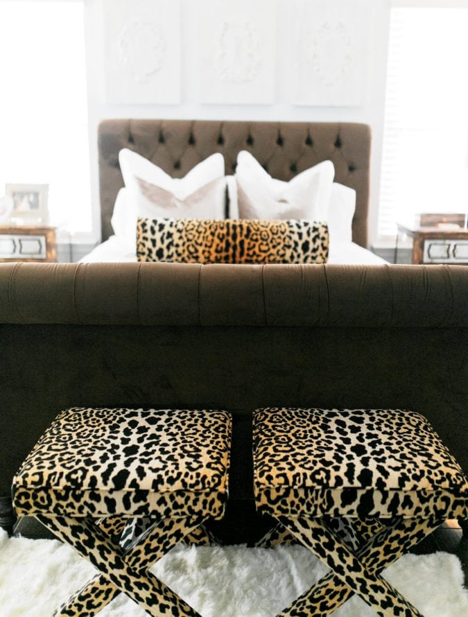
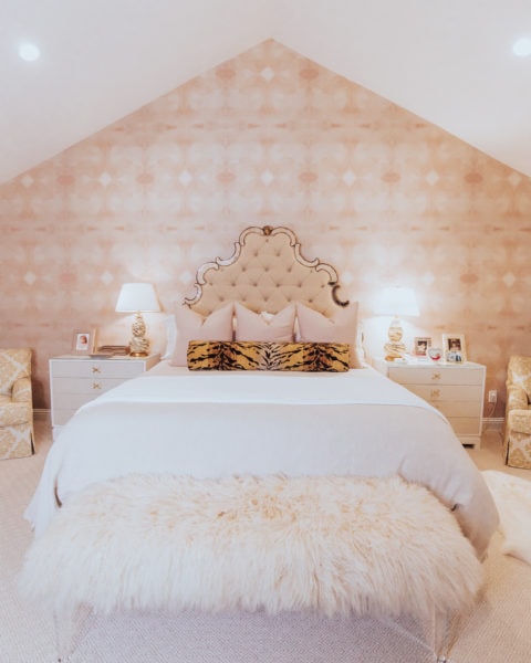
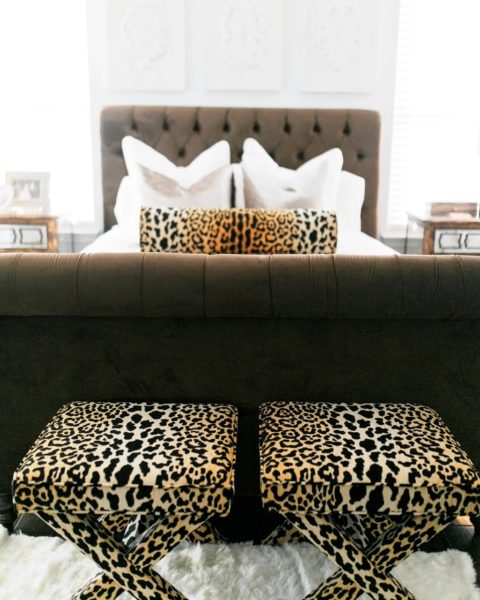
Y’all know I love to plan rooms in Adobe Photoshop and that’s how I start to visualize a space before I buy any furniture. I put the master bedroom off until right before we moved and all I could think about was getting a neon light, replacing our bulbs with festoon ones, and a chocolate-velvet bed. It embraced the masculine design-hues I wanted, while still feeling cozy. I also knew if I went with darker furniture I could embrace all the feminine touches to soften the space up. As you can see in the before, the space was veering far more glam than I intended and overpowering the bed. Around November I ordered a light fixture online on a whim and thought it would soften the space up. It came in and was awful- I mean awful. I could only exchange for store credit, so I was just even more upset and frustrated at my own mistake. Paul and I sat down and decided that for our sanity it made much more sense to hire a designer than it did to make mistake after mistake on rooms and end up wasting money. *Okay, okay. If you insist, husband! ;)*
When Maddie came and looked at this room she told me she could tell where I was going, but that we needed to start at the top down. This room had no light fixtures and therefore, had nothing to guide the style of the space, therefore certain pieces were competing instead of complementing. If you wish to learn more about what you can do for an additional lighting for your rooms at home, you can go to the website to opt with any of your concerns.
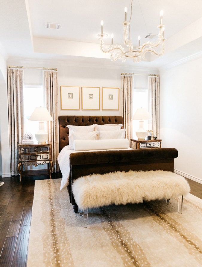
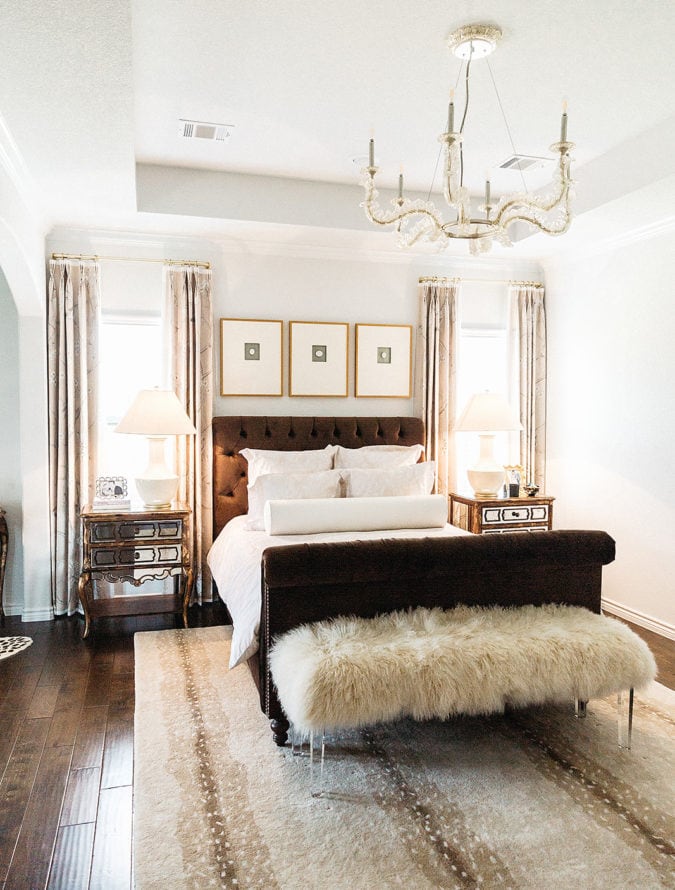
Today, I’m excited to partner with Corbett Lighting in this reveal and share the stunning chandelier Maddie Hughes chose. I feel it just incorporated those feminine and romantic details I wanted in a master, I just wasn’t sure how to combine. I always tell Maddie, “I’m torn between glamorous, french country and feminine details all at once.” To blend those styles, Maddie chose the Cielo fixture by Corbett. The glass finish looks like ruffled silk up and gives a nod to a Parisian style. It has a silver finish and Maddie has taught me you can 100% mix metals in your home- it’s just like jewelry. She just says you want to make sure that it mixes softly- remember complement not compete.
We had our fixture installed just last week and I’m so happy this project is complete. I crave a master that feels luxurious enough it’s an escape, but soft enough you can cozy up and watch a Lifetime movie before bed. I think that Maddie absolutely embraced both aspects of that design and I couldn’t be more grateful. If you are wanting to makeover a space {or just finalize decor like I did}, a modern chandelier can transform the room from the ceiling down while complementing your existing furniture.
I hope you enjoy this before and after, I’ll have another post with room details soon!
What’s your favorite feature of the space? Browse more lighting here.


The new light matches your bedroom SO well, Katey! It looks beautiful! 🙂
Charmaine Ng | Architecture & Lifestyle Blog
http://charmainenyw.com
Thanks, girl! xo, Katey
I love how it it turned out!!!!! You have to be so excited!
Amanda | http://www.cashmereandjeans.com
Thank you so much, Amanda!! I am just beyond thankful to have such a nice room to escape in! 🙂 xo, Katey
Oh my gosh it looks SO good! Truly obsessed with this space.
xo Laura Leigh
http://www.louellareese.com
The new lighting looks beautiful Katey – it totally makes the room! Love your home decor posts.
xoxo A
http://www.southernbelleintraining.com
It looks beautiful! Where are the gold frames above the headboard from?
Hi Cathleen! Thanks so much! My designer found them, but in my next master post I’ll link everything! xo, Katey
Love all of it!! I really like the patterned shades, very pretty touch. Oh and of course the rug!!
Your master bedroom is stunning!! Love the color scheme <3
BlondieintheCity.com
I LOVE the chandelier!! I’ve always wanted to put a chandelier in our master bedroom but I am so afraid to get rid of our ceiling fan! The idea of sleeping without a fan literally gives me anxiety!! Lol!
Such a cozy space! Beautiful! Will you be sourcing your curtain rods! Love the chic simplicity!
Yes! They were custom through my designer, but I will share all of that! 🙂 xx, Katey
I love the bench in your master with the fur and acrylic legs. Where is it from?
Hi Bella! It is from Parker & Hyde! xo, Katey
What’s the wall color??? I HAVE to know!!
Our paint color was Benjamin Moore “Decorator White.” 🙂